Navigation
The path to users’ tasks
Navigating is never a user task, and Mybring users shouldn’t have to learn and remember how to do it. Navigation should, therefore, be minimal and type-based instead of a massive fixed hierarchy. We achieve this by providing context-relevant paths and actions. For instance, a page can have contextual navigation without having regional navigation.
Mybring navigation types
- Global
- Regional
- Contextual
- Backward (discouraged)
- Local (deprecated)
Global navigation (frontpage and header dropdown)
- Content: The main areas (regions) of Mybring.
- Intention: Direct navigation to the main areas from anywhere.
- Mapped with user rights, served by Mybring Layout.
- Shows the name of the current area.
Regional navigation (side menu)
- Content: Subsections without a particularly strong connection to one another. “New shipment” and “Address book” as separate subsections are examples of correct usage, while “Bulk documents” and “Make new bulk document” are too closely related and should be found within the same subsection instead of being separate.
- Intention: Navigation within a subsection of Mybring. Not required if you can manage without.
- Position: The sidebar, or below the header on smaller viewports
- The active page’s/region’s link must have the
aria-current="page"attribute. - Mybring Layout provides all necessary CSS and requires the HTML to be
structured as follows in the respective applications:
- On the
navelement, we add an aria-label attribute with the application’s name as the value to communicate what the navigation covers. For example,aria-label="booking". We don’t add “menu” or “navigation”; that is already implied by the element and announced by screen readers. - Inside the nav element, we add an unordered list with links. Lists provide structure, and screen readers announce the number of elements.
- Some apps have superuser links; place them in a sibling
ulelement inside the samenav.
- On the
HTML example
<nav
  id="mybring-nav"
  class="mybr-layout__sidebar regional-nav"
  aria-label="booking"
>
  <ul>
    <li>
      <a href="url" aria-current="page">Name in sentence case</a>
    </li>
    <li>
      <a href="url">Name in sentence case</a>
    </li>
  </ul>
</nav>
Contextual navigation
- Content: Links to related content based on what has been identified as the users’ needs within a page or flow.
- Intention: Giving the the user paths to what is relevant in the current context.
- Markup and CSS can vary from place to place since they depend heavily on context, but it’s a good practice to default to links and then expand to more custom card-like styling if necessary.
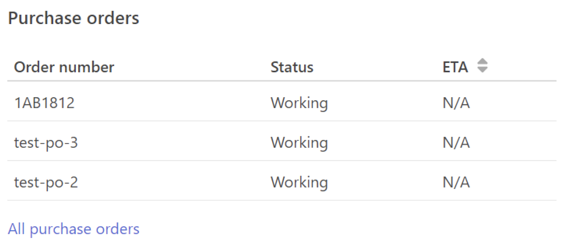
The basis of contextual navigation is to offer the content or functionality the user needs in context instead of making the user navigate to it. For instance, connecting the recipient for a shipment to the Mybring address book in a smart way or linking a shipment in the order history to the correct invoice are good examples of how this can be achieved.

Insight for success
Contextual navigation is always based on solid insight into our users’ needs and behaviour in every context. Adding the relevant links (or even buttons) to cover those needs is what makes it successful. Linking the order history and invoices in Mybring is a good example of how the needs can often span Mybring areas and team domains, so it’s important not to let team boundaries get in the way.
Buttons and functions
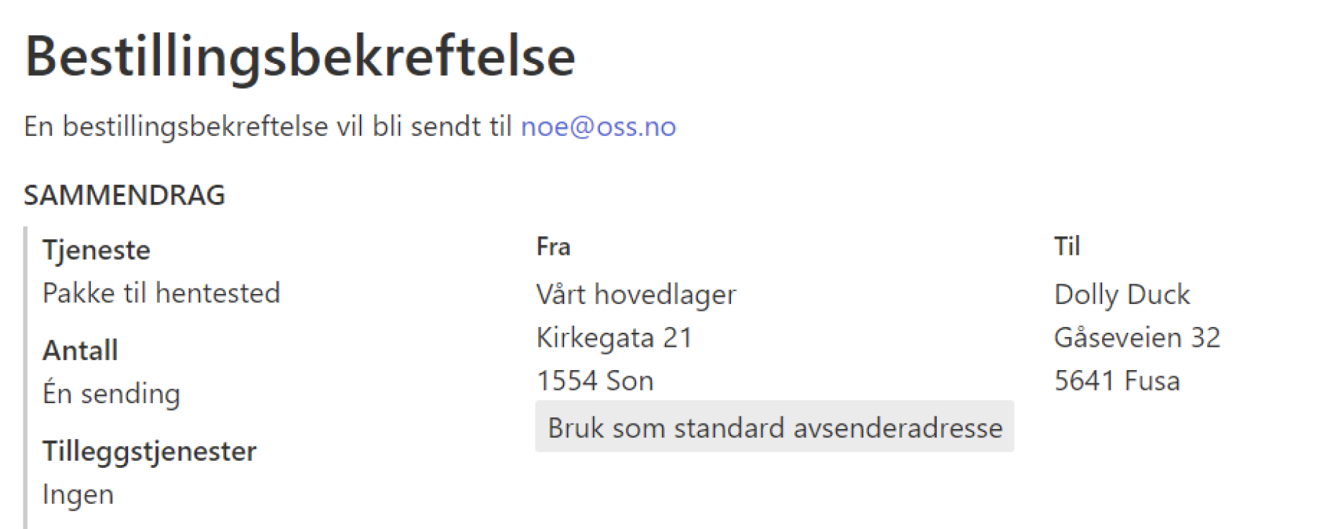
Even though buttons are not considered navigational elements, they play an essential role in contextual navigation. Buttons to perform key next-step actions should be placed in context in the same way as links. They both reduce the need to add navigational elements to Mybring. Having an “Add item” button with any relevant list of items ensures that the user does not have to navigate to where this can be done. The functionality is moved closer to where the user is – less navigation is a key point in working with any navigation.

Dynamic content
Contextual navigation opens the door for utilising dynamic content. More options for good contextual navigation appear if you adapt the content to the user’s situation. An empty list could be replaced by an “Add item” functionality. A “Use default” function could be replaced by a “Define default” function if the default settings has not been set.

Backward navigation (discouraged)
This should rarely be used; because Mybring has mostly one-level deep pages, there’s no need to add back links. And contextual navigation will almost always replace the need for any additional back navigation. But in the case that it’s actually needed, don’t hijack the browser functionality for this, let the browser’s back button work like expected.
| Element | HTML | Usage |
|---|---|---|
| Cancel |
<a class="btn" href="#" title="{page title}">Cancel</a>
|
A link styled as a cancel button can be useful in forms to give the user control close to the submit button. The title attribute has info about where the link leads to. | ← {page title} |
<a href="#">← {page title}</a>
|
Useful for the few instances where there are multiple levels. Keeping an active menu point for the parent page makes it clear what area the user is in. |
Local navigation (deprecated)
Local navigation is deprecated, don’t use it in any new interfaces. For the most part, it can be replaced with contextual navigation, but since the two are conceptually different, it requires more work than switching out one component with another.